Let's Connect
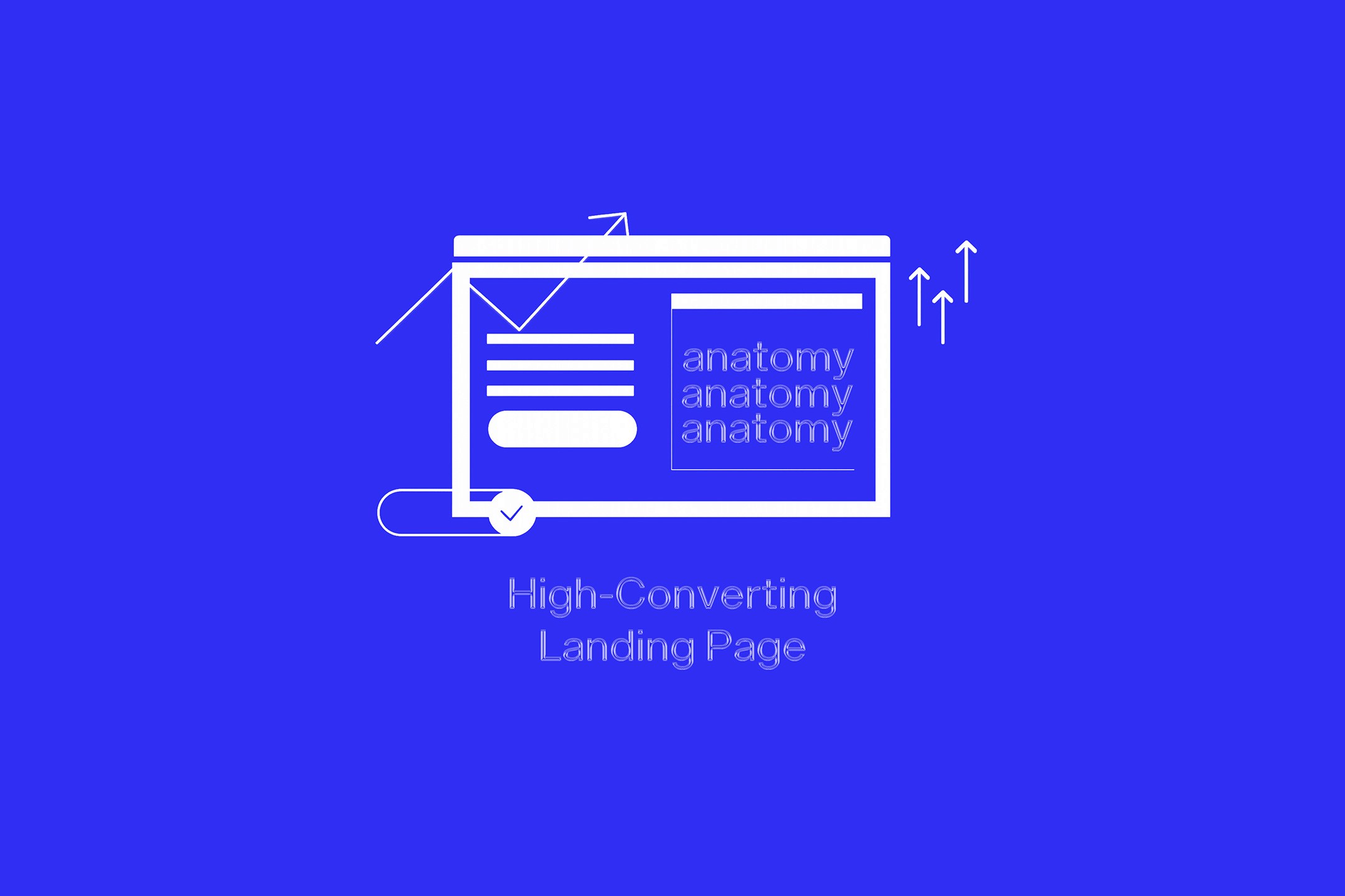
The Anatomy of a High-Converting Landing Page
A landing page is not a regular page on your website. A homepage is a lobby with many doors—About Us, Services, Blog, Contact. A landing page is a single, focused room with one door and one purpose: to compel a visitor to take one specific action.
It is the ultimate specialist in your digital toolkit. Whether you're driving traffic from a paid ad, an email campaign, or a social media post, this is where the conversion happens. Its job is to be so clear, compelling, and frictionless that the desired action becomes the most logical next step for the user.
Dissecting a successful landing page reveals a masterclass in psychology, persuasion, and clarity. Let's examine its essential components.
The Guiding Principle: Singular Focus
Before we explore the elements, we must embrace the philosophy that governs them all: one page, one offer, one goal. A high-performing landing page is ruthlessly minimalist. This means:
No Site Navigation: The main header and footer navigation are removed. You don't want a visitor to get curious and wander off to your "Team" page. The only way out is through your call-to-action or by closing the tab.
One Primary Call-to-Action (CTA): Every element on the page should guide the user toward completing the same single action—downloading a guide, signing up for a webinar, requesting a quote.
With this principle in mind, let's look at the anatomy.
1. The Headline: The First Five Seconds
This is the most critical element. If your headline fails, nothing else matters. It must instantly answer the visitor's unspoken question: "Am I in the right place?"
Its Job: To grab attention and communicate the primary benefit in a single, powerful statement.
Execution: It should be benefit-driven, not feature-focused. It promises an outcome.
Weak: "Our New Project Management Software"
Strong: "Finish Your Team Projects On Time, Every Time"
2. The Supporting Headline: The Immediate Clarification
Located directly beneath the main headline, this short sentence or two adds context and reinforces the value proposition.
Its Job: To explain how you deliver on the headline's promise or to elaborate on the core benefit.
Execution: If the headline is the "what," the sub-headline is the "how."
Example: "Our intuitive platform helps you track progress, delegate tasks, and eliminate bottlenecks, all in one place."
3. The Hero Shot: The Visual Proof
This is the primary image or short video at the top of the page. The human brain processes visuals exponentially faster than text.
Its Job: To create an emotional connection and visually communicate the desired outcome.
Execution: Show the product in context or, even better, showcase the result of your service. A picture of a smiling person successfully using your software is better than a screenshot of the interface. An image of a beautifully finished kitchen is more powerful than a picture of your work van.
4. The Persuasive Copy: Benefits Over Features
This is the body of your page. It’s where you make your case. The cardinal rule here is to translate every feature of your offer into a direct benefit for the user.
Its Job: To logically persuade the visitor that your offer is the solution to their specific problem.
Execution: Use clear, scannable formatting like bullet points or checklists.
Feature: "Our guide is 50 pages long."
Benefit: "Get a comprehensive, step-by-step blueprint to solve [problem] in one document."
Feature: "1-on-1 consultation."
Benefit: "Receive personalized advice tailored to your unique situation."
5. Social Proof: The Trust Signal
People are wired to follow the lead of others. You must demonstrate that other people have already chosen you and were happy with their decision.
Its Job: To alleviate doubt and build credibility by showing that others trust you.
Execution: This can take many forms. Use a combination:
Testimonials: Direct quotes from happy clients, complete with their name and photo for authenticity.
Client Logos: The logos of well-known companies you've worked with.
Case Studies: A brief summary of a problem, your solution, and the positive result.
Star Ratings & Numbers: "Trusted by over 10,000 users" or "Average 4.9/5 star rating."
6. The Call-to-Action (CTA): The Final Step
This is the button the user clicks to complete the conversion. It must be impossible to miss.
Its Job: To provide a clear, unmissable instruction for what to do next.
Execution:
Design: Use a contrasting color that makes the button pop off the page.
Language: Use action-oriented, first-person text. Instead of "Submit," use "Get My Free Guide" or "Book My Consultation." The text should describe what the user gets.
Placement: The CTA should appear multiple times on a longer page—once above the fold and again after you've presented your main arguments.
The Unseen Element: Message Match
This is the critical link between your ad and your landing page. The promise made in the ad must be instantly reflected in the headline of the landing page. If a user clicks an ad for "50% Off Running Shoes," the page they land on must immediately echo "Get 50% Off Your New Running Shoes." Any disconnect creates confusion and causes visitors to bounce.
The Afterthought That Matters: The Thank You Page
The conversion isn't the end of the conversation; it's the beginning. After a user fills out your form, don't just show them a generic "Thanks!" message. Redirect them to a dedicated Thank You Page.
Its Job: To confirm the action was successful and guide the user to the next logical step, building momentum.
Execution: Use the Thank You Page to:
Set Expectations: "Your guide has been sent to your inbox. It should arrive in the next 2-3 minutes."
Nurture the Lead: Suggest they follow you on social media, read a related blog post, or watch a tutorial video.
By meticulously assembling these components, you create more than just a webpage. You construct a highly efficient, persuasive engine designed to transform passive interest into decisive action.

Ajay
chief executive officer